Hello, world-class designers!
Even if today is the 4th, I’m still going to wish you a happy new month nevertheless. After all, it’s still the first week of the month, so that should count for something, right?😂
There’s this tweet flying around that says “Now, it’s time for the VIPs’ birthdays”. So, if you were born in September, leave a comment on this letter so we can celebrate you as the VIP that you are🥳
Because you should be treated with honor and specialty, I have made sure to research and select the best topics for the rest of the year. You’re welcome!
So, who’s ready to dive in?
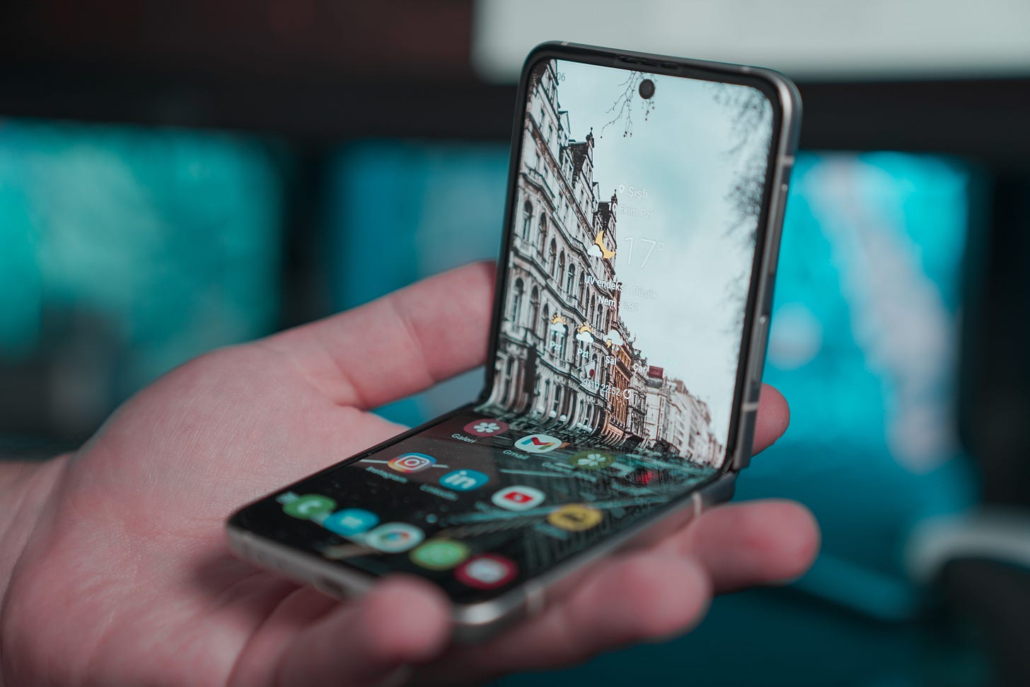
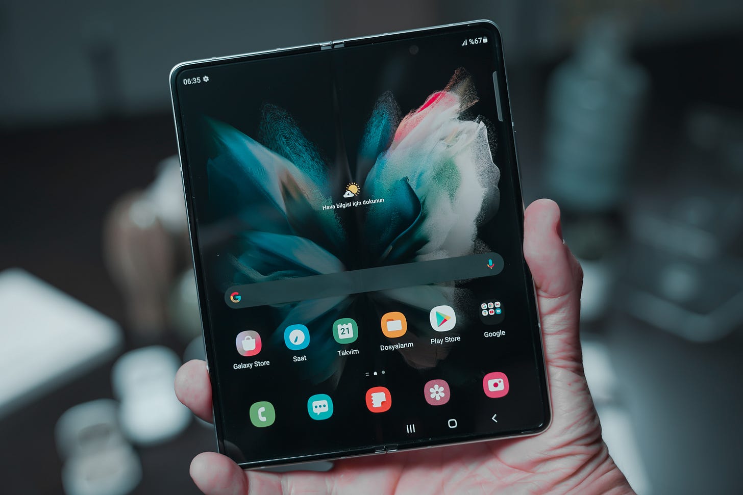
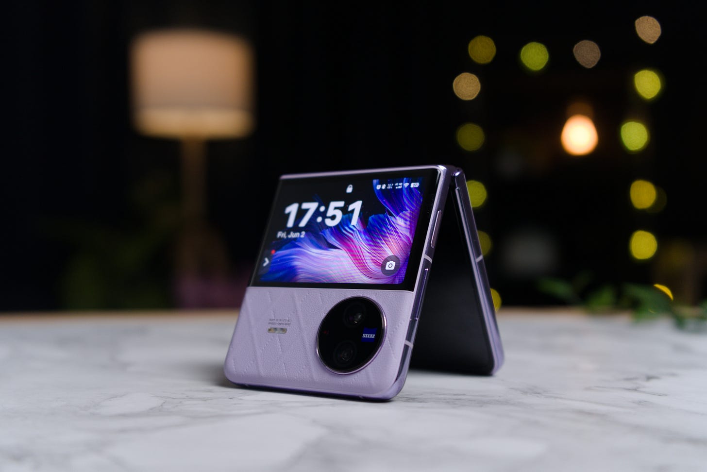
Have you ever just looked at a foldable device, mentally redesigning the user interface in your head? You’re not alone!
Foldable screens are like a multi-layered cake, and we're all still figuring out the best ways to frost and layer these bad boys.
No, this isn't a sci-fi fantasy or the work of aliens. This is the bendable, and intriguing reality of tech today. And guess who's on the frontline to make these foldable screens as functional as they are fabulous? You got it—it's us, the design community! (Told you we have superpowers, didn’t I?).
If you have been searching for a sign to start designing for foldable screens, this letter is the one! Here, I’ll be sharing the tips I have found and experimented on, details, tools, and examples to help you understand better when you decide to experiment.
So, ladies and gentlemen, shall we?
UI/UX and Foldable Devices.
As a UI/UX designer, here are 5 important details to know before starting out the design for a foldable device:
1. Your Design Should be Responsive
A design is responsive when its approach is aimed at creating interfaces that provide an optimal viewing experience—easy reading and navigation with minimal resizing, panning, and scrolling—across a wide range of devices, from mobile phones to desktop monitors and in this case, foldable devices.
Tips For a Responsive Design in Foldable Devices
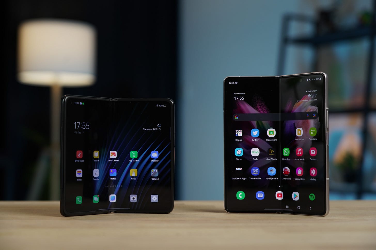
Details: Your design should automatically adjust when the device is switched from its closed or folded position to its open or unfolded position.
Example: Designing a reading app that shows a single column when folded and two columns when unfolded.
2. Continuity and Seamlessness
This is the ability of the interface to adapt fluidly as the device transitions from one form factor to another without losing user context or introducing jarring changes.
Tips For a Seamless Design in Foldable Devices
Details: As the device switches between folded and unfolded states, the UI should maintain context and adapt seamlessly. For instance, a video playing in the folded state should continue to play seamlessly when the device is unfolded.
Requirements:
Android Jetpack's WindowManager: For Android-based foldables, this helps manage how your app displays on foldable and large screens.
Apple's Auto Layout for iOS: For iOS devices, this can help handle transitions between different screen sizes.
3. Hinge and Fold Mechanics
The way the device bends or folds, can cause some parts of the screen to look strange or limit how you can use the interface.
Details: When you fold a device, like a book, the middle part might not show things very well because of the way it bends. This can make some parts harder to see or interact with. Designers must account for this in their layouts.
Requirements:
Device Emulators: Use these to test how your UI appears in the crease or hinge areas.
Custom Grids in design software: To visually indicate where the hinge or fold is, helping you to avoid placing key elements there.
4. Multi-Modal Interactions
These are the different ways a user can interact with the device depending on its folded or unfolded state. Each "mode" can be optimized for different kinds of tasks and interactions.
Details: Foldable devices often have multiple "modes" based on their position: fully folded, semi-folded, or fully unfolded. Each mode can be better suited for particular tasks.
Requirements:
Prototyping Tools like Axure or Principle: These tools help you simulate different states and transitions to ensure a seamless experience.
Motion UI libraries: To animate transitions between modes smoothly.
5. Hardware Considerations and Constraints
These are the unique hardware features and limitations of foldable devices, such as varying aspect ratios, multiple screens, or potential wear and tear at the folding points, which can impact UI and UX design.
Details: When a device can fold, it might have a screen that's shaped differently or made of parts that could get worn out more easily. This can make it a bit tricky to decide where to put things on the screen or how to make them work.
Requirements:
Native Development Kits (NDKs): These provide more low-level access to hardware features.
Battery and Performance Testing Tools: Given the larger screens and potentially more demanding UI, these tools help you check if the device runs smoothly and doesn't use up its battery too quickly.
Designing for foldable devices is a journey of creativity and innovation, and as technology evolves, we will be able to explore more possibilities together.
Now, to the most exciting part of our newsletters
Remote Job Openings For You
1. UX Designer - Remote Contract Role
Skills:
Proficiency in design tools such as Figma, Adobe CC, Spline 3D, Axure RP.
Interested in getting more details about this opening? Apply HERE.
2. Product Designer at Ness
Requirements:
If you don’t meet 100% of the below qualifications, you should still seriously consider applying. We take a holistic approach to evaluating talent for our team.
Have 4-5 years of experience in product design, with work that's made its way into consumer-facing software (ideally, iOS).
Have a design portfolio that showcases your eye for good visual design and attention to detail.
Are a systems-thinker and can see beyond the pixels.
Are highly collaborative in a remote-first environment and enjoy sharing work early and often.
Do you feel you’re an ideal candidate? Apply HERE.
3. Visual Designer at Amp X
Requirements:
Comfortable in taking initiative, with a proactive and driven mindset to work without constant supervision.
At least 3 years of visual design experience, preferably with technology companies and/or consumer products
A great portfolio with case studies that demonstrate your process
Strong understanding of the principles of graphic design and print and how to use them effectively and creatively (Color, Typography, Layout and Composition, and Hierarchy).
Does this sound like you? Then you should apply HERE
To get access to more openings around you immediately after they are posted, check out this page and turn on your notification.
Thank you for joining today’s episode and I hope you learnt something new!
In the meantime, keep pushing boundaries and crafting remarkable user experiences. And most importantly, don’t forget that this is another day to be world-class 🚀


