Building a Design System as a Solo designer in a startup
Design systems can be a lot to handle, it's even harder to pull it off as a solo designer. Is it even possible? Well, here is my experience - my wins and where I failed as well.
It’s been 3 years working at Raise and shifting the entire design narrative in the company solo and this is my story. Sit back and enjoy a hot cup of coffee or a glass of wine while reading this. This is generally a high level overview of work on the design system - It’s a bit lengthy but it’ll be worth it. I tried to cover a lot .
The Big Question
I work in one of the toughest startup ecosystems in the world.
Raise is a B2B company based in Kenya, building cap table and equity software for African businesses. Our customers are primarily charged in USD. If you’ve ever tried to get companies earning in local currency to pay in foreign currency, you know it’s no walk in the park. The solution? Delivering so much value that customers are happy to pay.
The question was -
How do we build design infrastructure that scales, improves the overall user experience, and positions the company to deliver immense value to customers while driving revenue growth?
How I started
I joined Raise in January 2022 as a Product Designer after freelancing for a while. I was excited and looked forward to the journey. But onboarding was a crash course in private equity—and it felt like rocket science.
But if there’s one thing about me: I’ll never back down from learning something new. This was the start of a long but thrilling journey..
A Broken System
When I started, there was a Figma design library. It was functional, but:
Rigid. No flexibility to evolve beyond its initial scope.
Manual processes. I juggled documentation on Confluence, QA tasks, and even marketing content support.
At one point, I was basically Doctor Strange of Design—bending time and space to keep things moving. (Shoutout to my “Jack of All Trades” award at the company’s end-of-year event!)
We kicked off an experiment called Raise Labs, to explore how the platform could evolve beyond the limitations of our current library.
Problems with the initial design
Onboarding required excessive hand-holding.
High churn rates.
UI cluttered with walls of text trying to over-explain.
Copy was technical and hard to understand—a customer once had to carefully explain Raise to another founder to onboard them.
Our marketing visuals weren’t compelling.
At the end of the experiment, it was clear
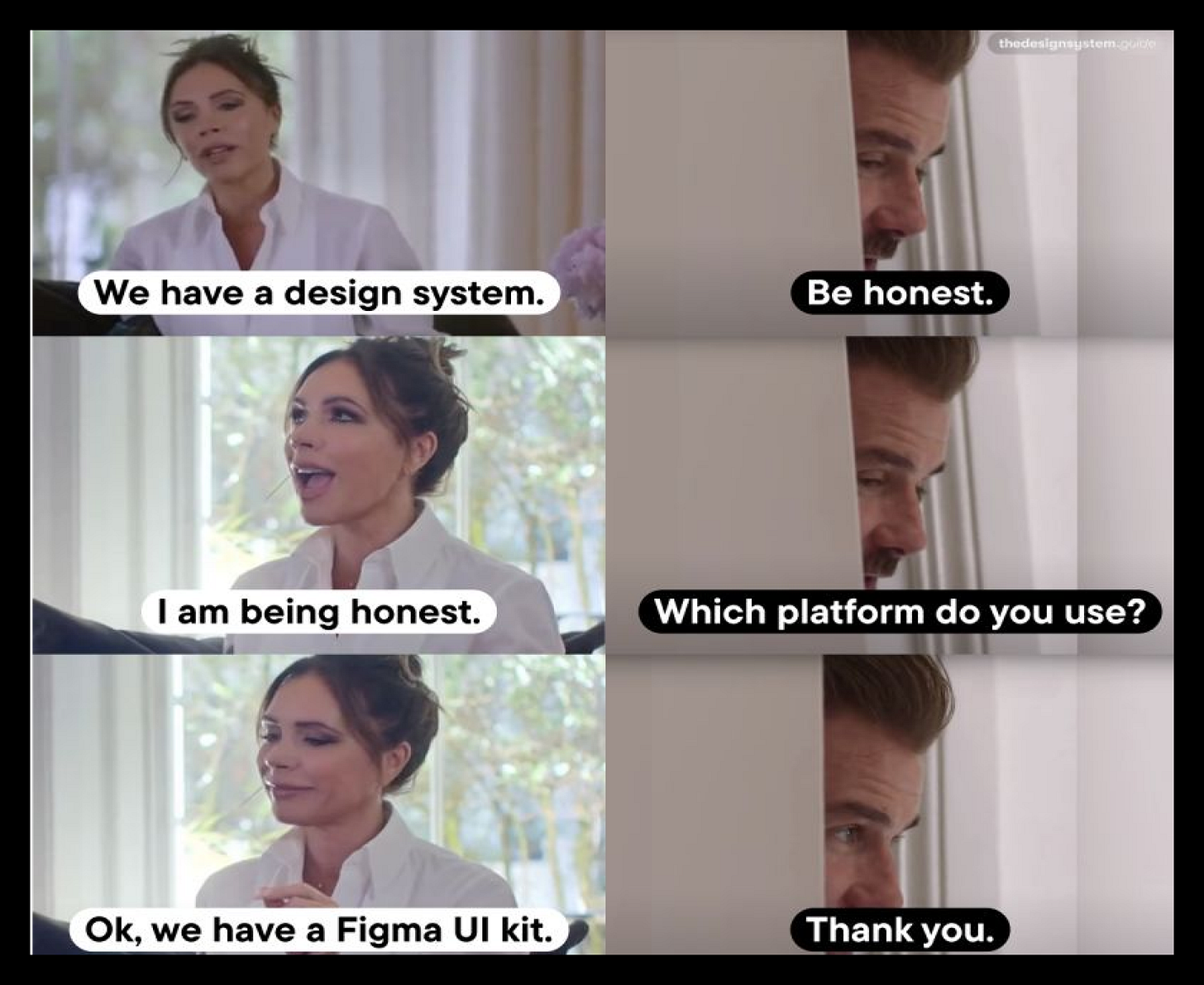
We needed a design system. A real one.
We looked at it carefully and the team let me take the lead on it. I had two main challenges:
I had never built a design system in my life before - I could set up a design component library in Figma but a full blown design system - I was definitely getting ahead of myself.
I was the only designer here - most companies who have design systems have dedicated teams running their design systems. Juggling this with supporting marketing around felt like I was calling for burn out.
You need an unhealthy amount of delusion to be successful at anything
We didn’t see anyway forward for the product if we didn’t do this and I had an unhealthy amount of delusion to go on with it . The plan was simple (or so I thought) - In 4 weeks I had to :
Learn about design systems
Set up the component library
Write documentation which would include code blocks if needed
Should be easy right?
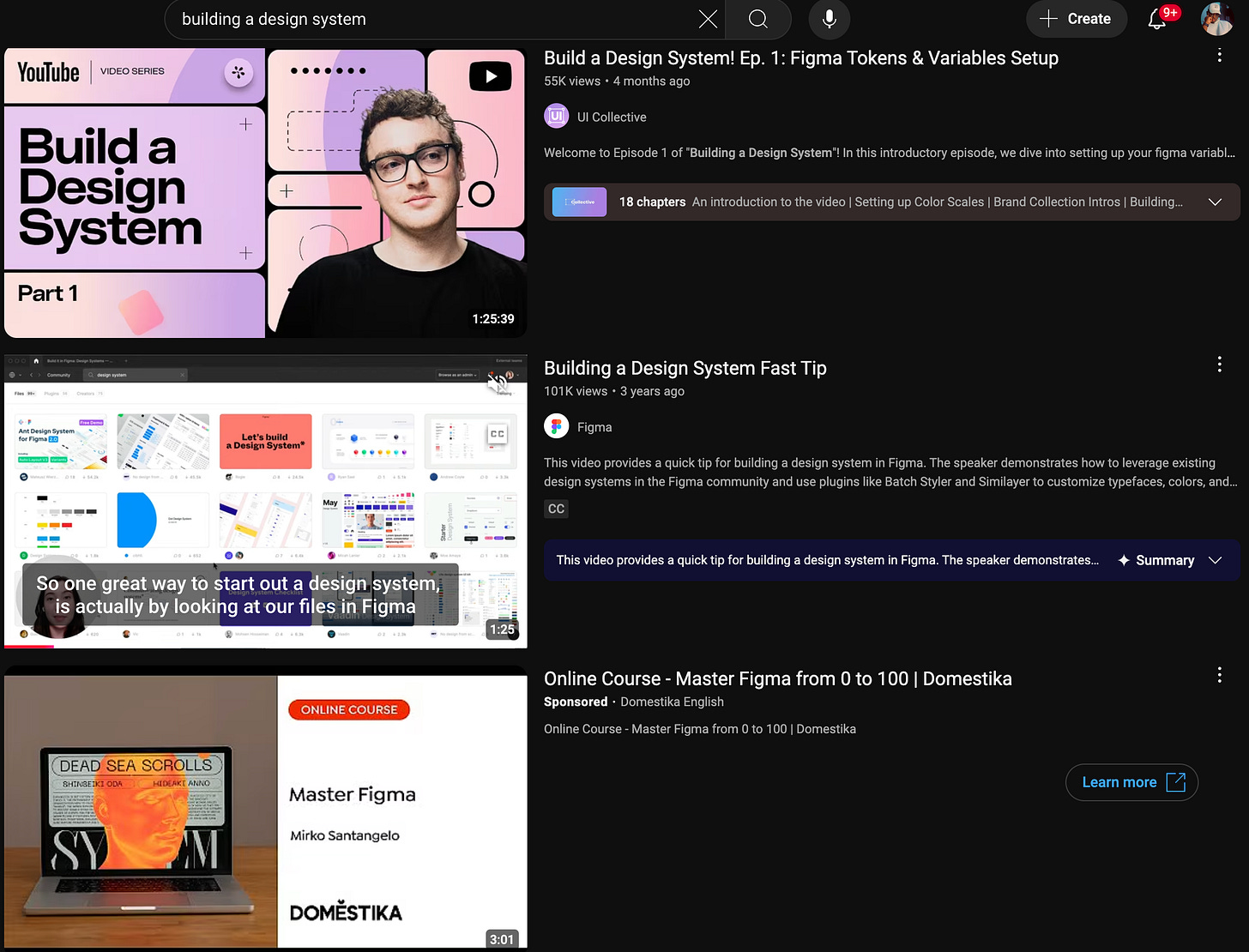
Let’s find out how that went. I started off with Youtube.
Research
Youtube
The problem with Youtube was that all the videos were referring to building component libraries in Figma and call it “Design Systems”.
None of the videos showed how to build end to end from Figma to Code & Docs - This is likely because processes for running and building a design system in teams vary depending on the internal tools the team prefer to use so it’s probably a bit tricky to create an end to end tutorial that covers all this .
Now this is not to say I didn’t learn anything from Youtube, it actually gave me a basic foundation on understanding how design tokens work. Design tokens are very important if you want to actually build a usable design system. If you already understand how to build a component library this should be the first thing you should search for.
Docs
I decided to read docs to figure out how design systems are structured and I started again from the most popular ones - Atlassian, Material Design, Adobe Spectrum etc.
I hit another roadblock with these - Their docs are really good but also they are quite large and there’s no way you can use them as a yardstick for your docs because you’re building solo. So, I started to look out for smaller design system docs and finding these felt like I hit a jackpot.
They were so concise, short but extremely functional and I could model my documentation based off it. Pie.design helped me learn about design tokens so much just by studying what they had.
To help with documentation - I also created a custom gpt called Design GPT with standards to help me document faster
One solid resource I also recommend is The Design System Guide.
Engineering Collaboration
For design systems to work, you need to be in sync with engineering - especially when there’s a current build to know which stack and libraries are in use and make sure any decision you make helps them ship faster and cohesively.
The team was using Chakra UI, and I selected Untitled UI as our base for customization.
Auditing
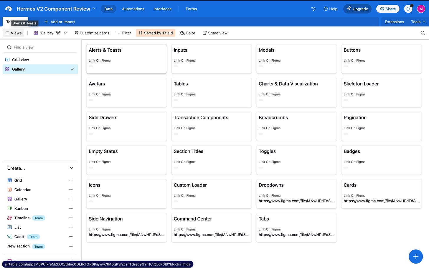
I created an Airtable document and wrote down a list of the components we needed to build - either using Chakra’s default or customized to look like Untitled UI components.
We also set an acceptance criteria for the custom components:
Functionality: Does the third-party component meet our needs?
Visuals: Does it match our style or is it easily customizable?
If yes to both: ✅ Build a customized component.
If no: ❌ Stick to default Chakra.
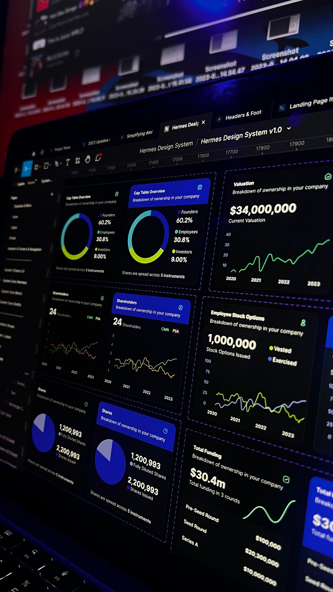
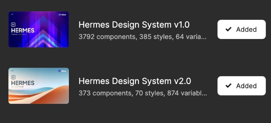
Setting Up Hermes 1.0
Research and auditing was done and it was time to set up the design system properly. The overall direction of the design system visually was to give the product a de-fi, hence we prioritized dark mode and gradients. Even our homepage for Hermes 1.0 had a lot of cards with interesting gradients.


What I setup for this
Matched the system with Chakra Docs.
Used Supernova.io for documentation.
User testing with Maze (130+ volunteers).
QA via Iteration X (comment directly on web builds).
Built initial visualization of equity as 3D coins
I’d explain the reason for the equity visualization as it’s a core part of the product before I continue.
Equity when you think of it as a concept feels a bit abstract. You know it exists but you can’t really point to a particular icon or element and say - that’s represents a SAFE or that’s a Common Share - it’s usually in form of a long document. Since we were also looking to bring in the defi experience into a cap table platform. Visualization was needed.
You can find a full thread of this visualization on X-
Here’s a few images as well -
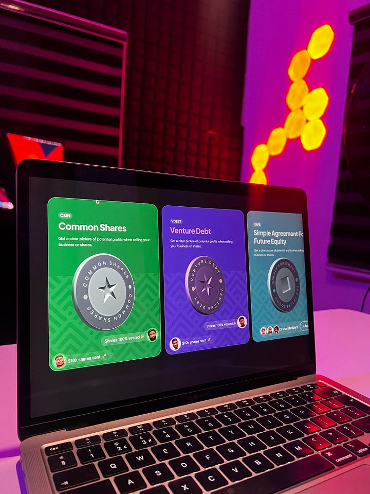

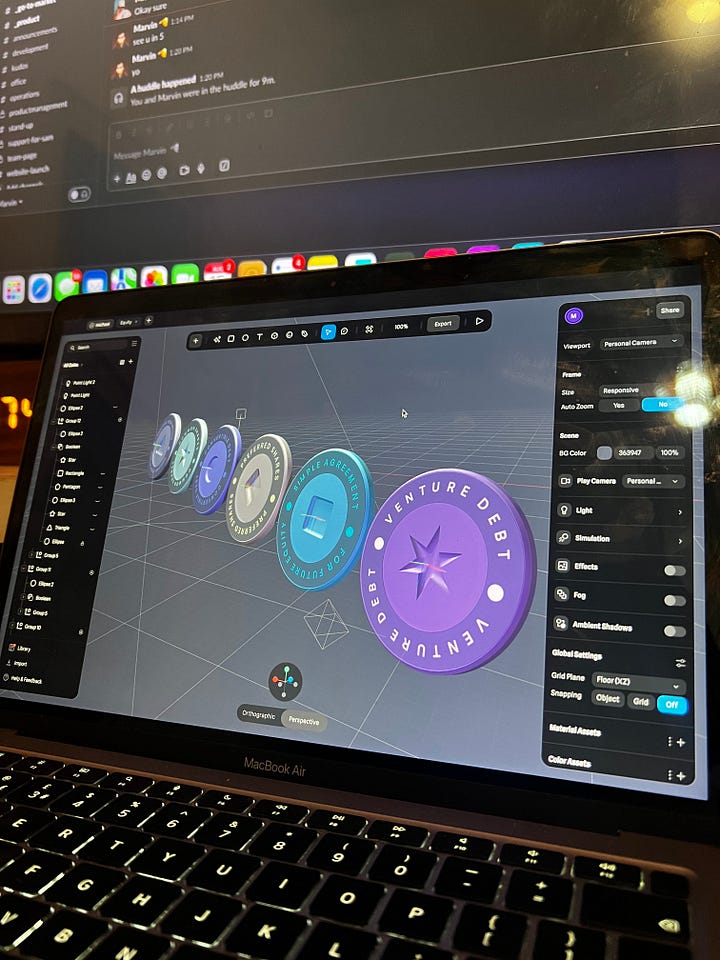
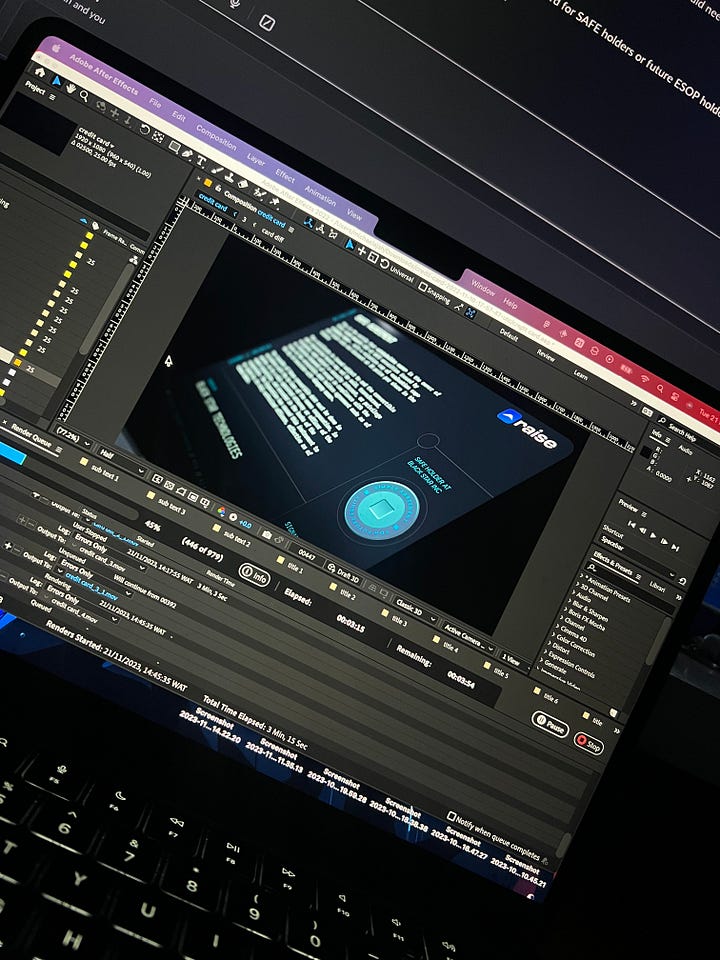
After this was done, I moved to designing other parts of the product and marketing materials, also redesigning our logo in the process as well.
Some additional marketing collateral -
You’d see the old logo at the first screens and the new logo at the end because I had recorded the shots before the logo was redesigned.
And there’s this -


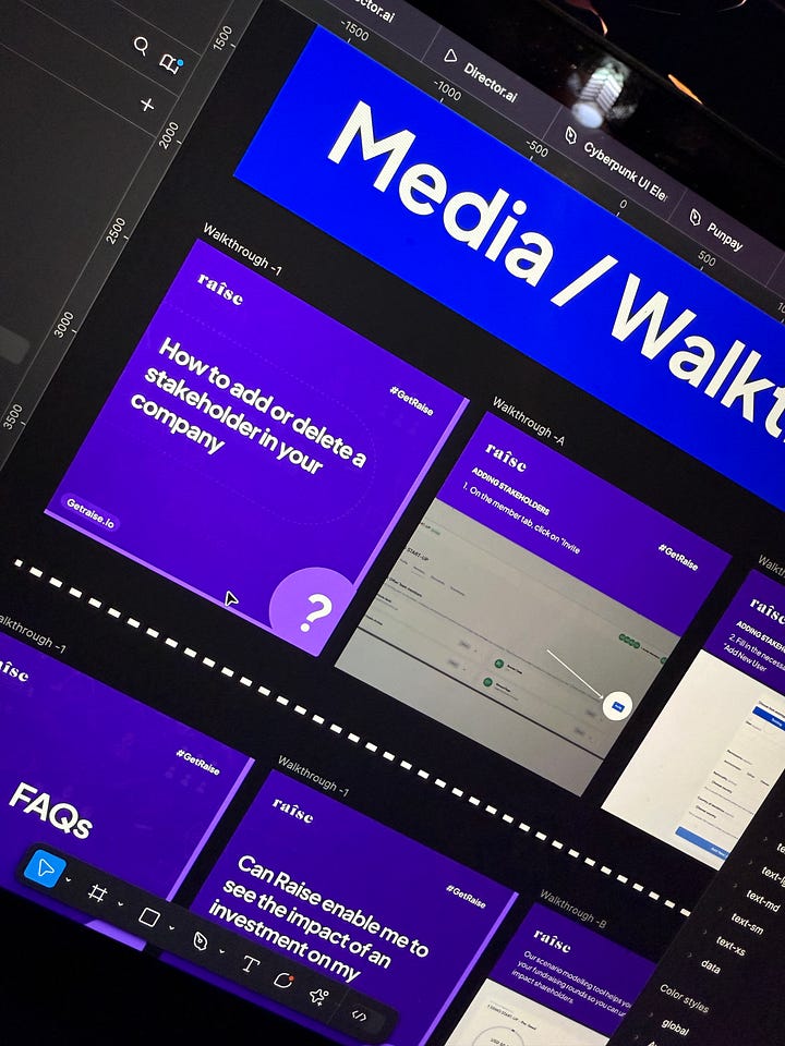
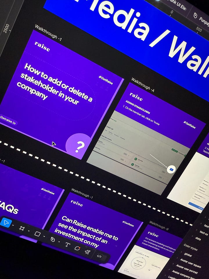
So I had marketing covered as well.
Now we now had about 4 engineers actively working on the product and things were moving fast but after a few months.- things began to break slowly on the product side.
What broke in Hermes V1.0?
It started with the custom components - Chakra out of the box doesn’t look good visually from a design perspective, so we had to customize a lot of component.
Secondly, we weren’t actively keeping track of new components (because we had to build a lot of custom ones) - we would have cases where an engineer had already built a component but another engineer was unaware and built that same component.
In hindsight this could have been avoided if we documented properly using Storybook, but that wasn’t set up. The other issues that occurred with Hermes 1.0 were a few more underlying issues we hadn’t resolved.
We had reduced the copy on the platform to be more readable and concise but our landing page then still felt like an essay competition. (It’s those few times where you wonder how to strike the balance between marketing copy and clean design - we eventually figured this out in our next iteration)
Customers wanted a light mode version and the system was built to be primarily dark mode - (I eventually fixed this properly when Figma released variables a few weeks after I had setup a plugin to switch the colors)
Customers weren’t actively using the product yet as much.
The design library was huge and had many unused components. I had imported Chakra into Untitled UI but kept a lot of the Untitled UI components.
This wasn’t scalable so we moved on to overhaul the entire system.
Building Hermes v2.0


Switching to ShadCN UI was a controversial move. Engineering teams hate breaking dependencies (rightfully so).
We had discussions around
Combining Radix with ShadCN
Customizing Chakra to match ShadCN
Implementing ShadCN directly.
After weeks of discussion, we took the plunge—and it was worth it.
A major challenge
One of the driving factors for building the new design system was also to position the product better.
We had struggled for years to build an easy to use cap table platform for African startups that we could actually sit back and watch customers use without being involved as much as possible. We had only 3 months to build this. How were we going to pull this off - without compromising on quality?
The solution to this was - build our design system on ShadCN with very minimal customization.
Auditing
We also had another audit session to review ShadCN components and build out any custom components if needed.
The only question that came up. during the audits was selecting a chart library since ShadCN didn’t have charts at the time. It was between these libraries -
Tremor
Recharts - which was our Default library
ShadCN released a chart library based on Recharts later so we didn’t need to switch entirely.
Refining The Product UX
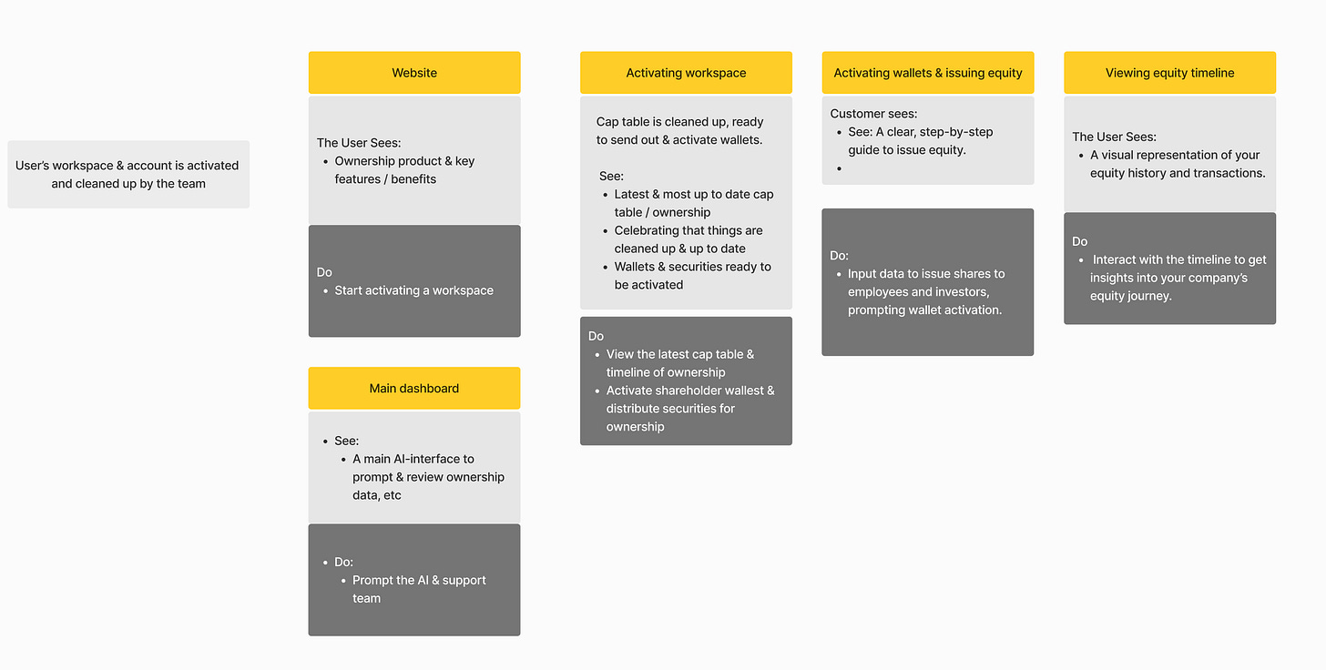
One of the standout highlights of Hermes v2.0 was the approach we took to designing screens more intentionally. Shoutout to Alex for introducing the “See-Do Process”—a principle that became central to our design philosophy.
At its core, the “See-Do Process” emphasized two key things:
What customers see on a screen should be immediately clear and focused.
What customers can do on that screen should be intuitive and frictionless.
This simple yet powerful approach refined how we thought about every feature, every flow, and every interaction. Once this foundation was set, we moved on to implementation, iteration, and gathering continuous feedback from our customers as we built.
Setup
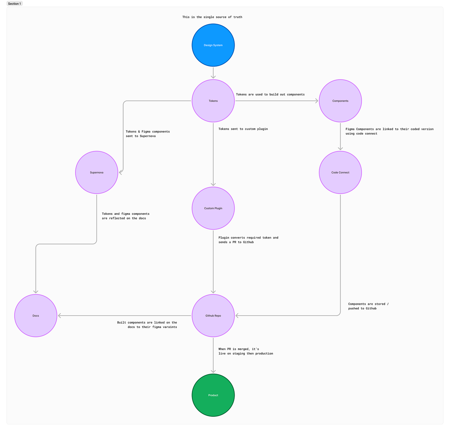
To ensure our design system could scale smoothly and stay aligned , I laid out a structured flow:
Design Tokens → Supernova, Custom Plugin, and Code Connect
Supernova: Managed design documentation and token handling.
Custom Plugin: Exported design tokens to GitHub and sent automated pull requests.
Code Connect: Intended to sync code with design components (though we didn’t get around to fully implementing this).
While Supernova had native token exporters, they didn’t deliver values in the format our engineering team needed. So, I built two custom Figma plugins:
ShadCN Exporter - Ensured design tokens were properly structured for ShadCN integration.
ShadCN Variable Generator - Generates variables that match what ShadCN requires.
Both plugins are now available on the Figma Community.
Zapier Automation
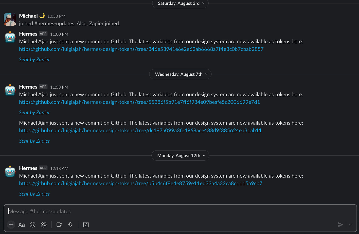
I also setup a bot in a channel on slack using Zapier that sends automated notifications when an update is made to the design system.
Component Naming
Consistency was critical. Every component in the design system was named exactly as it appears in ShadCN. Custom components followed a clear naming convention to reduce any ambiguity. This tiny but functional standard reduced confusion and errors during development.
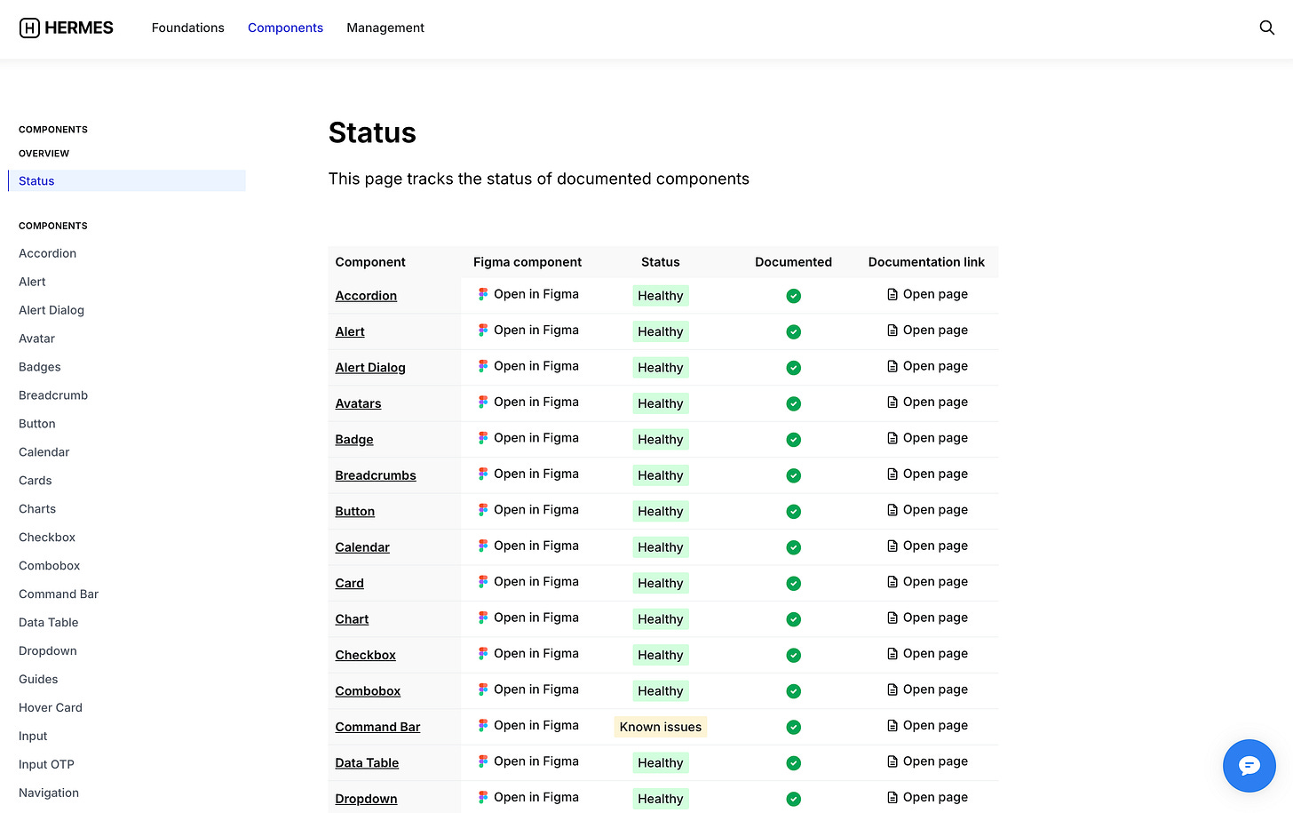
You might have noticed the floating chat icon in Hermes Design System v2.0 screenshots. That’s the chatbot I built using Voiceflow so engineers could now simply ask the chatbot questions like:
“What button dimensions are we using?”
“Show me the alert component.”
See demo video (This was also part of the initial docs for v1 as well)
From Webflow to Framer
I also took over implementing our landing pages on Framer to ensure the final build is as close to the design as possible. (Our previous marketing website was built on Webflow, and maintaining it often required a dedicated developer.)
Challenges
No system is perfect. We encountered a recurring issue:
Full-page builds by engineers often overlooked smaller design details like spacing, typography, and alignment.
We switched our development workflow from page-by-page implementation to a component-first approach. Engineers focused on perfecting individual components before assembling them into pages. This small shift made a huge difference in quality.
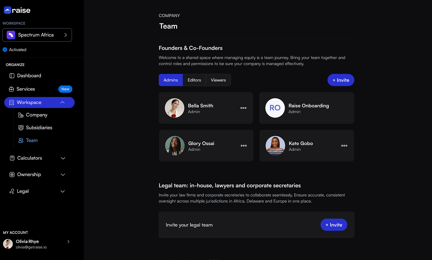
V2.0 UI
The results? Thoughtful design flows, clear screens, and a product that felt cohesive and polished.


Marketing was not also left behind as well - This is probably the best launch video I worked on so far
Here’s the launch video -
One key thing happened that changed everything as well - AI.
The AI Moment
AI tools started integrating ShadCN.
Anthropic's Claude introduced ShadCN artifacts for component building.
v0 by Vercel, Bolt, and Lovable joined the mix.
It felt like AI had knighted ShadCN as the default design library. Suddenly:
We could build components faster.
We could iterate with precision
This freed up my time to start working on our AI product features directly in tools like Cursor and v0 by Vercel.
Here’s a few rough I built out using v0
I also started to push towards using AI as a sales agent for the product, the goal for this was to reimagine the homepage and create a proper sales funnel with the agent as the sales person- ( we haven’t deployed this yet)
I tested out a few AI plaforms for this -
Deepgram
Livekit
Elevenlabs
I eventually went for Elevenlabs as it was a more cost effective setup - Demo here
Also built out our AI chatbot as well.
To do this effectively I had to:
Learn how to work with a RAG Vector database using Pinecone and built on Vercel’s AI SDK - since their SDK UI was based on ShadCN it was the best option to build on for us.
Learn how to use the Openrouter API.
Learn how to fine-tune a custom model using Together AI and I found out it was pretty expensive to deploy (Which forced me to learn how RAGs work )
This wasn’t a job for design but I wanted to support engineering and speed up development so I took on the role and handed off to engineering when they were ready to integrate it into the product directly. Even my once-dormant GitHub profile lit up again with commits.
(More on this in an upcoming post!)
Final Metrics
At the start of this story, I asked:
How do we build design infrastructure that scales, improves the overall user experience, and positions the company to deliver immense value to customers while driving revenue growth?
The results speak for themselves:
Raise achieved its highest revenue in history this year.
Raise also served more customers across 20+ countries - helping them organize their cap tables & legals which helped them raise a total of $15m+ combined
$100M+ worth of signed term sheets were delivered to customers and 50+ pre money valuation reports were delivered to customers.
The product is now smoother, more intuitive, and scalable.
Development time was sped up considerably
But none of this would’ve been possible without the incredible collaboration across our team.
Feedback
Putting in the work and getting feedback for all the effort put in has been a driving factor that kept me motivated everyday working at Raise.
Key Takeaways
Collaboration is everything. Success comes from design, engineering, and product teams moving in sync.
Feedback is king. Always listen to your customers—they know where the friction points are.
Be a generalist. When working solo, adaptability is your greatest strength.
Important Links
So this is the part where I officially make our design system public. I hope you learn a thing or two from it.
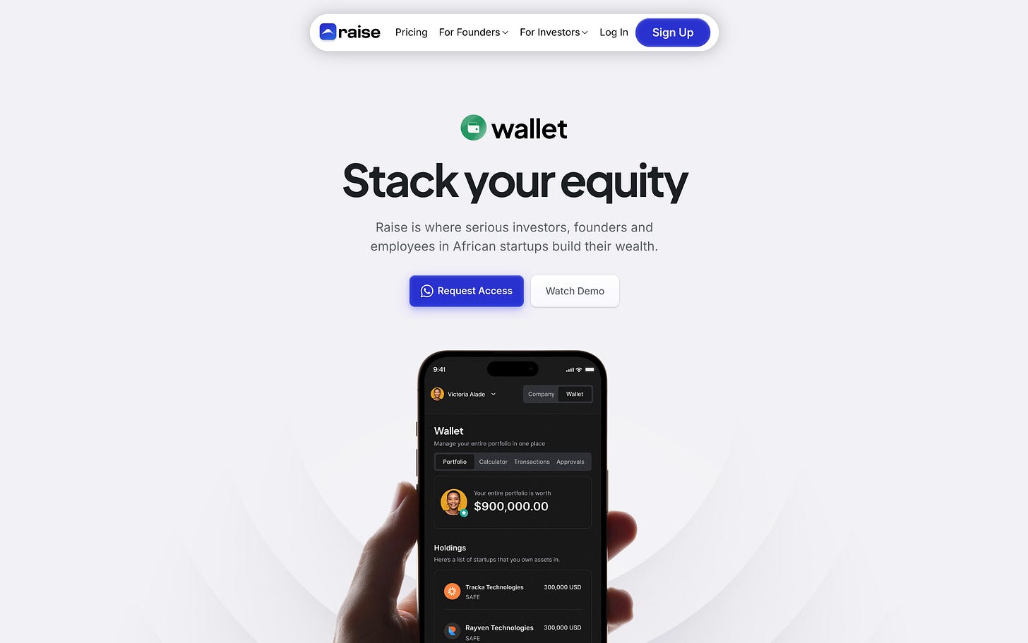
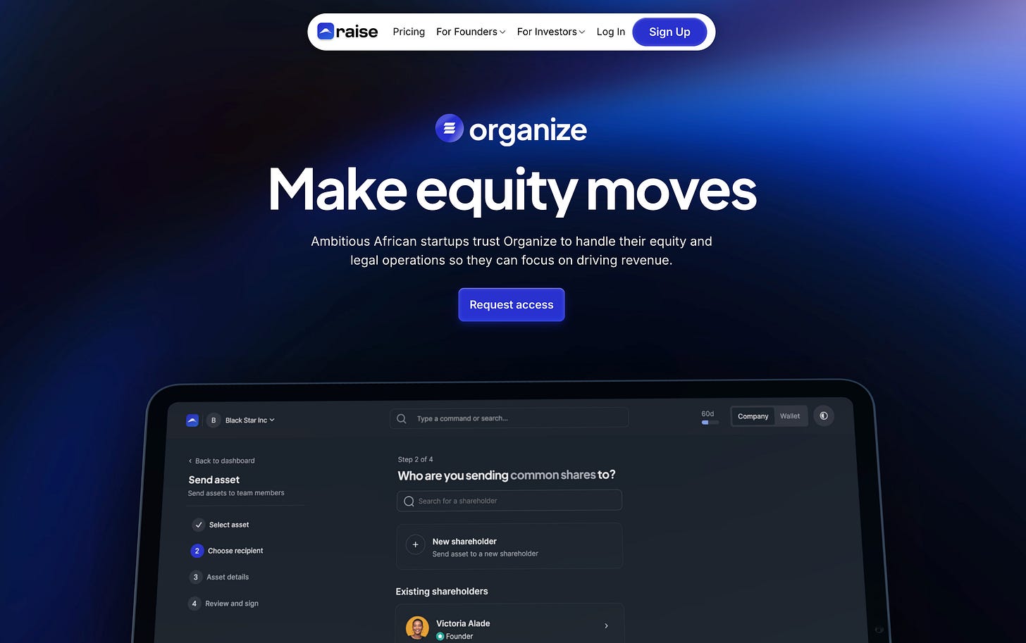
Raise.africa Homepage (Latest)
Final Thoughts
The Hermes Design System was just one of the many things I’ve had the privilege of building and contributing to over the past three years. I couldn’t have asked for a better team to collaborate with.
As with all design systems run by small teams, Hermes is still growing and its possible to find a few inconsistencies in implementation but those would be slowly fixed as the system matures since there’s an underlying design & dev infrastructure to handle this.
Also -In December, I wrapped up my full-time contract at Raise.
Looking back, these three years have been transformative—from building a scalable design system to reshaping product experiences and growing alongside an incredible team.
To everyone I worked with: thank you for your trust, collaboration, and support.
While this chapter has shifted, the story isn’t over.
Here’s to Raise, and to whatever comes next.
Thank you for reading. Here’s to even bigger milestones ahead. ❤️
Happy New Year



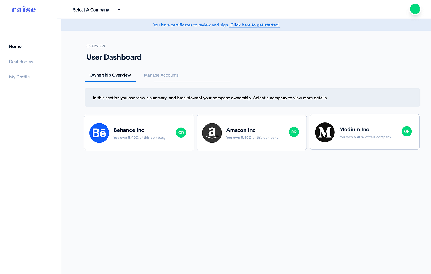
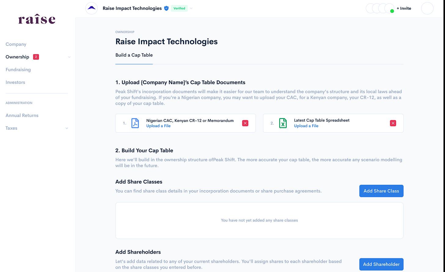
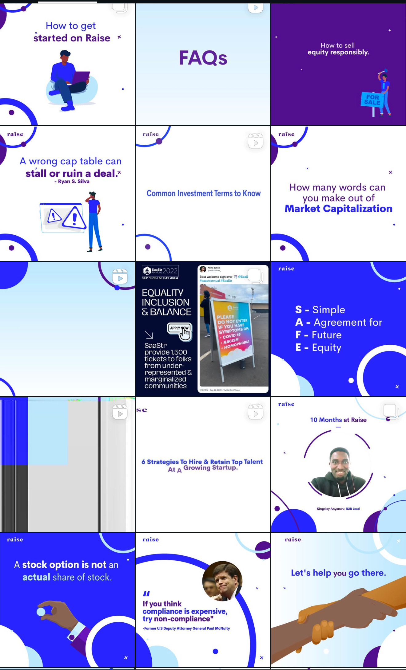


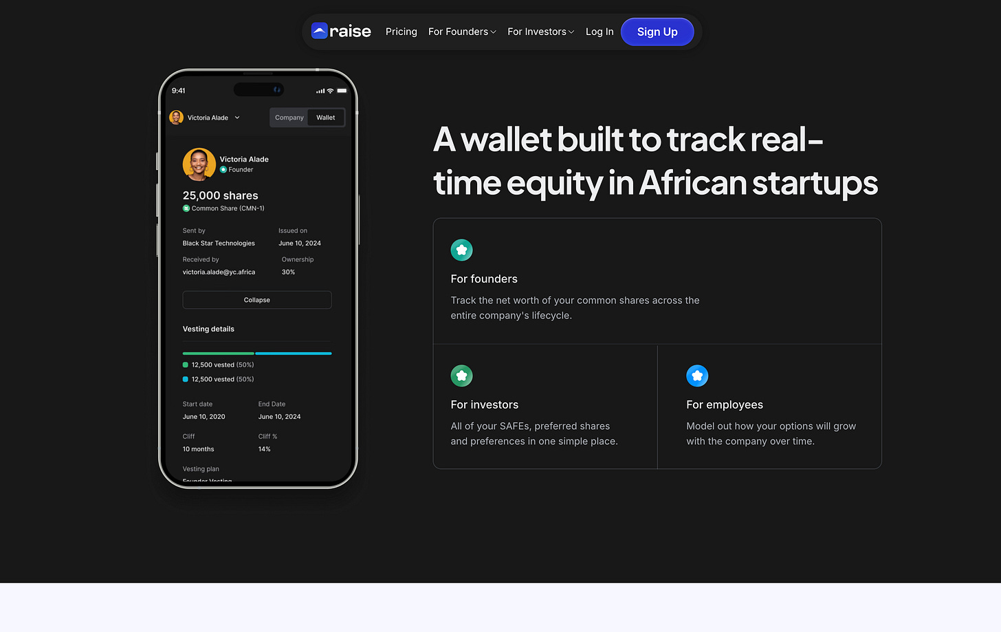
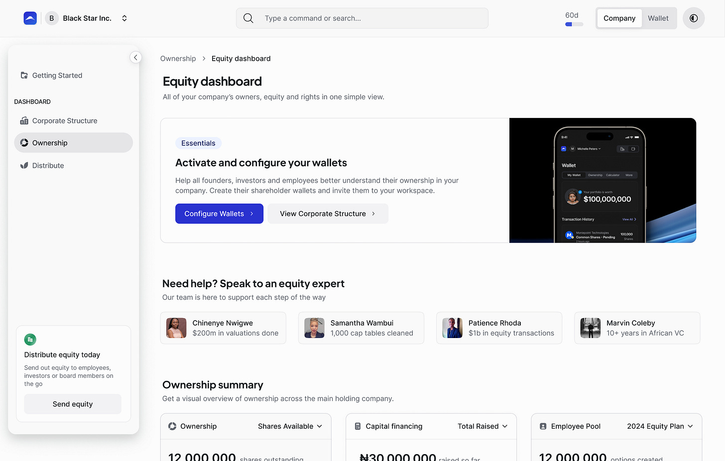
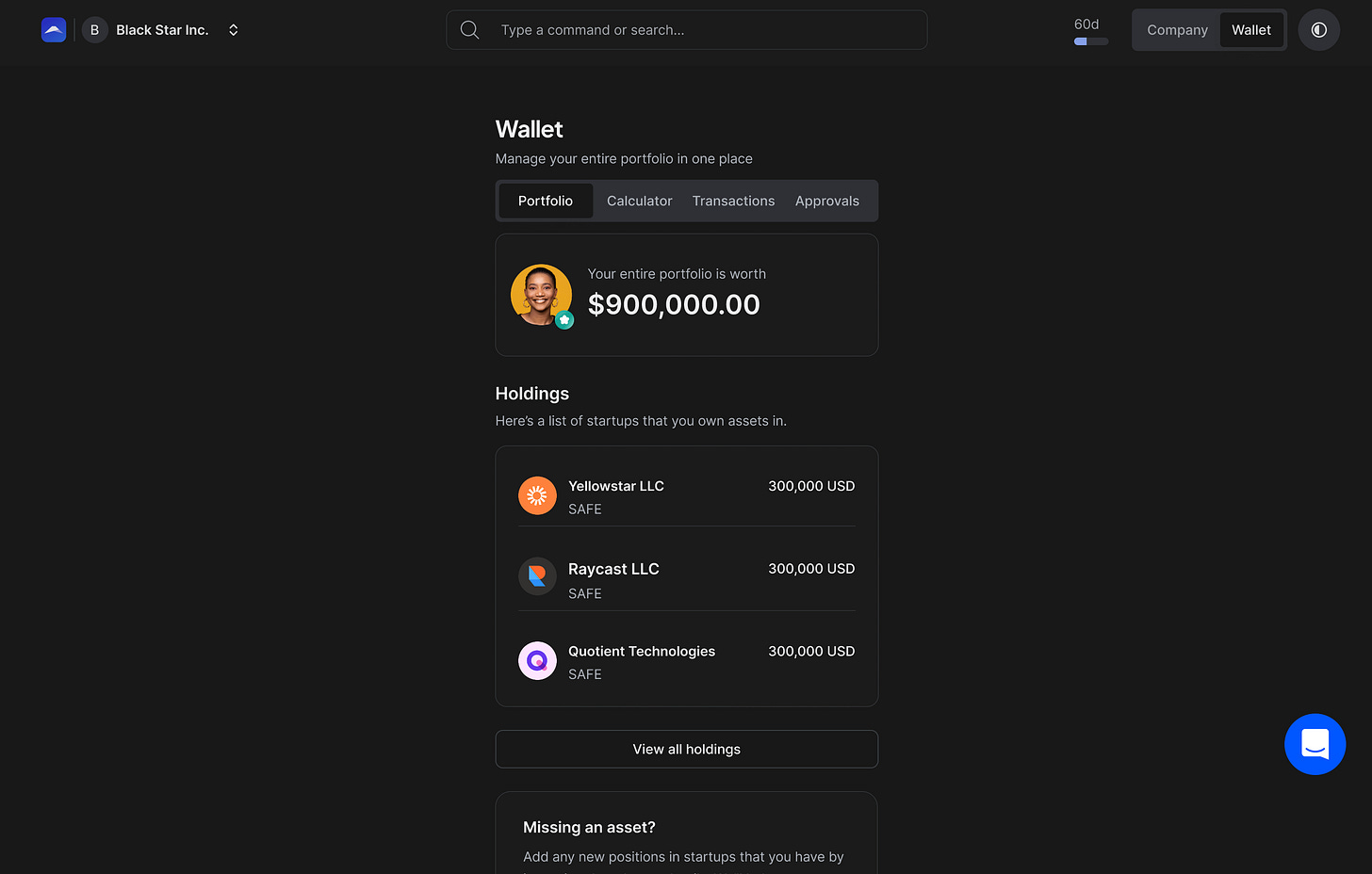
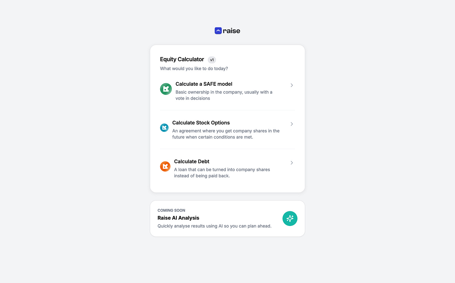


This is incredible work.
You played multiple fields and modelled how designers should think about design.
Awesome post. This is an excellent example of the behind-the-scenes work that's so important but most people never see.
How long did all of this take?